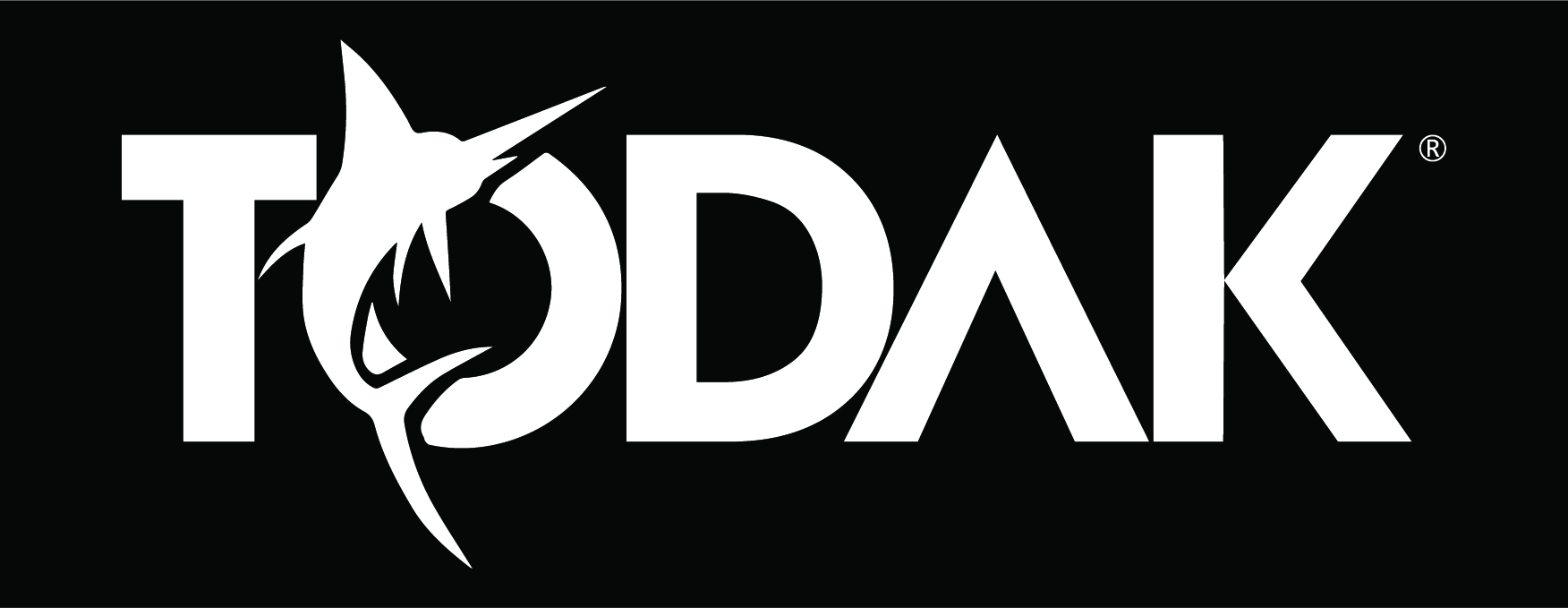
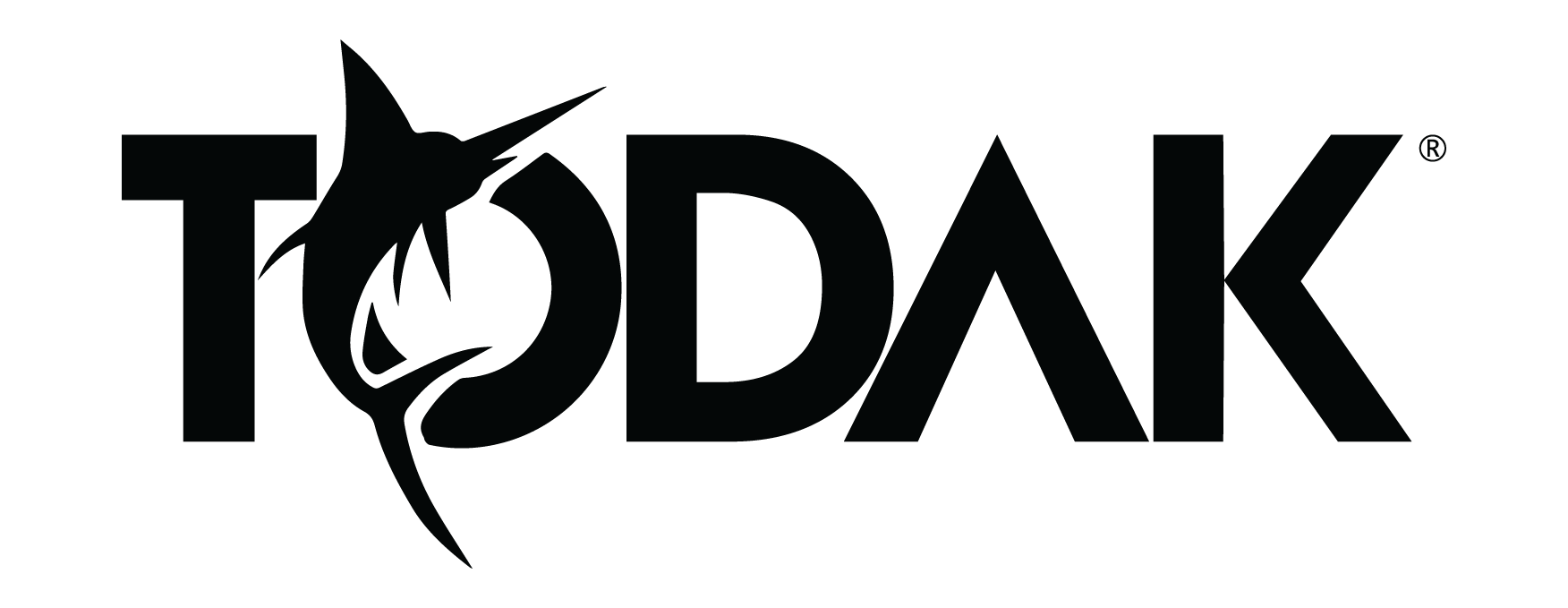
Our Logo
The horizontal lockup is our primary choice of logo usage as its clearly communicates our brand name.
Logo Usage
The black and white logo is set in all caps and must be applied according to the parameter laid out shown below. You will find the official logo in both black and white version. Please take special caution when applying the logo in different background, both full in colour and black and white.


CMYK Value of Our Brand's Logo
Strictly follow the colours for the logo as provided by the following colour chart. Changes in hue and inherent colour properties are strictly prohibited. If printing on high absorption or plastic material, please consult our printer in the best way to achieve the specified corporate hue.
WHITE
CMYK 0 0 0 0
TRUE BLACK
CMYK 60 40 40 100
SHADES OF BLACK

Incorrect Usage of Background Color
Do not place the logo on overwhelming warm or soft pastel colours and avoid placing the logo on patterned or busy background as it will subdue the logo presence in the visualisation.


Incorrect Usage of Our Brandmark
Do not apply any effects, adding outlines, stretch or pinch on the logo.

Inserting any form of shadows or effects on our official Todak logo is incorrect and strictly prohibited

Removal of the inner black colour from the Todak font while leaving the ‘Todak’ image untouched is incorrect and strictly prohibited

Altering the original colour to a different one is incorrect and strictly prohibited

Purposely blurring or changing the image quality of the original logo is incorrect and strictly prohibited

Any form of stretching or pinching to our original logo is incorrect and strictly prohibited

Any form of positional changes done to our original logo, such as slanting or turning, is incorrect and strictly prohibited